 |
| Music |
| Songs |
| Song Years |
| Song Artists |
| Song Titles |
| Song Charts |
| Albums |
| Album Years |
| Album Artists |
| Album Charts |
| Site Index |
Can the charts here tell us anything about long term trends |
|
There are a number of ways in which the data at this site can be applied to help reveal patterns in the way the music business changed during the 20th century. Externally we have seen analysis of the length of popular songs and the beats per minute (at //www.docstoc.com/docs/19643220/Trends-i n-BPM-of-Popular-Music-1900-2009). We have also done some calculations ourselves, for example estimating historic album sales. This page contains some results that we have found interesting but don't have an obvious place within the rest of the site. The topics discussed here are:
As with all the complex calculations described on the site you can decide to try a different approach. If your analysis shows something interesting tell us about it.
Words used in song titles
The fact that we have a listing of the 9,200 songs that achieved the greatest success in every year from 1900 to 2014 means that we can see how the choice of words changes. This reflects the names of songs that became hits, not necessarily the names of songs written.
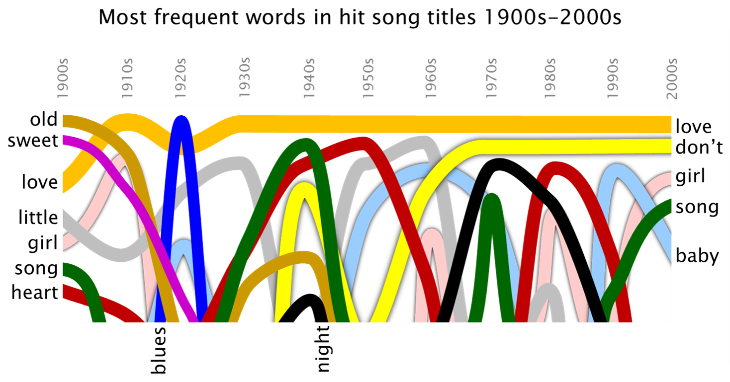
By far the most common word in song titles is, as one could have guessed, "love", There were just two decades where another word was in more titles, the 1900s (where the words "old" and "sweet" were more common) and the 1920s (where "blues" was the word of the decade). Since the 1970s the word "don't" has been the second most common. A different word in the third slot every decade "night", "heart", "baby" and "girl" so far.
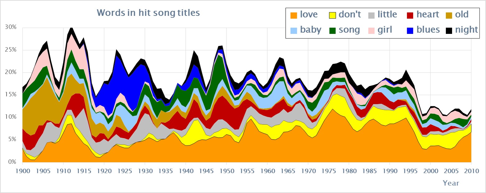
Looking in more detail we can see that the popularity of "love" was growing for most of the century, by its peak (say 1973 to 1996) it was so dominent that it could halve in size (by 1998) and still be the number one word.
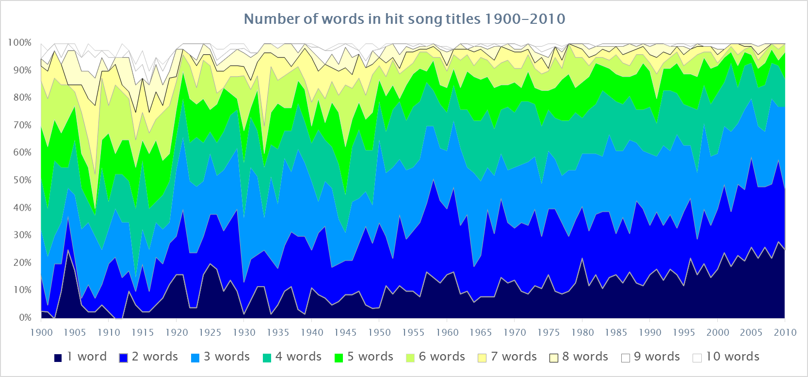
Between 1945 and 2010 the average length of song titles went from 4.5 words to 2.5 words. The trend towards ever shorter titles is driven by the number of songs with single words going from 7% to 23% over the same period.
Historical Context
One interesting question is whether the chart data here can help to illuminate any long term trends in chart success. For example are songs getting longer?
Obviously this data can only address the topics that it measures, that is the popularity of songs, artists and titles. The distribution of chart entries is clearly tied closely with the years being considered, so as with the determination of the most charted songs we have to compensate for that. When considering sales we have to find a way to estimate historic markets.

Once the scores have been adjusted to give each year an equal chance of producing the top songs it is interesting to see which years they actually come from. The plot above takes the top 6000 songs and shows the years that they came from, the top 500 in the far row, 501-1000 in the next and so on down to the positions 6001-6500 in the nearest row. The years 1900-1920 have been removed because the charts are too sparse to be valid.

Clearly the years 1940-1945 were not good years for general musical success, a tiny number of songs got all the attention and no-one else got anywhere, we guess people were focused on some other priorities. The absolute peak point seems to be 1965-1973, but in fact the whole of the period 1957-1989 is fairly high up. The start of the era clearly relates to the success of some key artists in the 1950s, in particular Elvis Presley, we suspect that most people would agree that 1956 is the real start of modern music. But what about the end at 1989? Here are three different possible reasons why the peak drops off after 1989:
- Music really has been getting worse since then. Pick your combination of:
- The heady days of our youth, when music had an exclusive hold have passed and today's kids have other priorities
- By 1989 music was no longer a way to rebel, if your parents had gone to Woodstock how shocked would they be by Paula Abdul?
- The short sighted behaviour of money-grubbing music conglomorates alienated the very people who are their natural market
- The evil file sharing public started seriously stealing music as the internet started hence there were no funds for promoting new acts
- The available data has some strange correlations and the result comes from an artifact in the original inputs
- The contribution of the "retrospective" charts. These emphasise yesterday's music and, as we can see from the artist profiles, the first nostalga kick sets in 20 years later (i.e. 2009 was the time for a Roxette come-back tour)
Given the way the calculation is made the second choice seems unlikely, which of the other two you pick probably says more about your own biases than the charts.
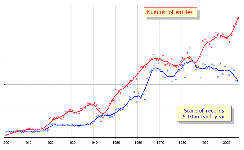
As can be seen elsewhere the volume of source data increases dramatically as the 20th century progresses. The plot above also shows how the "average" score changes. We have ignored the top 5 songs since the presence of a "White Christmas" or "Over the Rainbow" could radically skew the results from a particular year. The blue line shows the average of the scores for the songs in positions 5-10. In fact the ratio between the scores and the number of entries gives a good indication of how "universal" musical tastes are, in years where all markets are buying the same few artists the scores will be high, when each market has its own tastes they will be low.
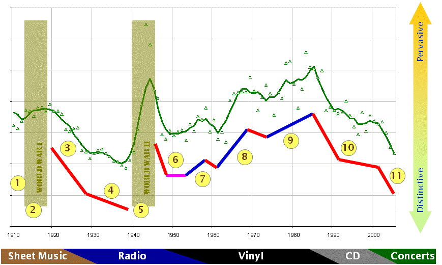
If we plot this ratio through the 20th century there are some interesting correlations with the key events and trends:
- Live Music: Vaudeville & self played
- World War I: A small number of universally successful songs
- Jazz: The first radio boom
- Big Band: Depression & Hollywood
- World War II: A small number of universally successful songs (again)
- Crooners: Comfortable music
- Rockers: Teenage rebellion I (fast & furious)
- Groovers: Teenage rebellion II (slow & mellow)
- Tomorrow the world: The same music everywhere
- Fragmentation: Musical tribes
- Collapse: Revenues nosedive
It is interesting that the peak in this indicator was in the mid 1980s, fifteen years before the start of the collapse in music revenue.
Overall Statistics
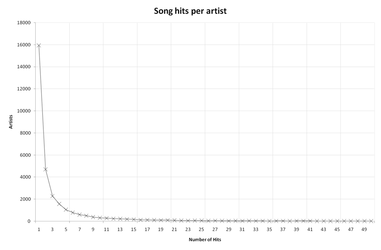
There are a number of overall statistics that the charts reveal, for example the chart above shows the number of artists with a given count of hits. About half of all the artists listed have just one song that became a hit. The curve then drops off with only a tiny proportion having more than 10 hits. There are many different curves that could fit this profile, which one fits best? The way to answer that question is to change the vertical scale from a linear one to a log one.
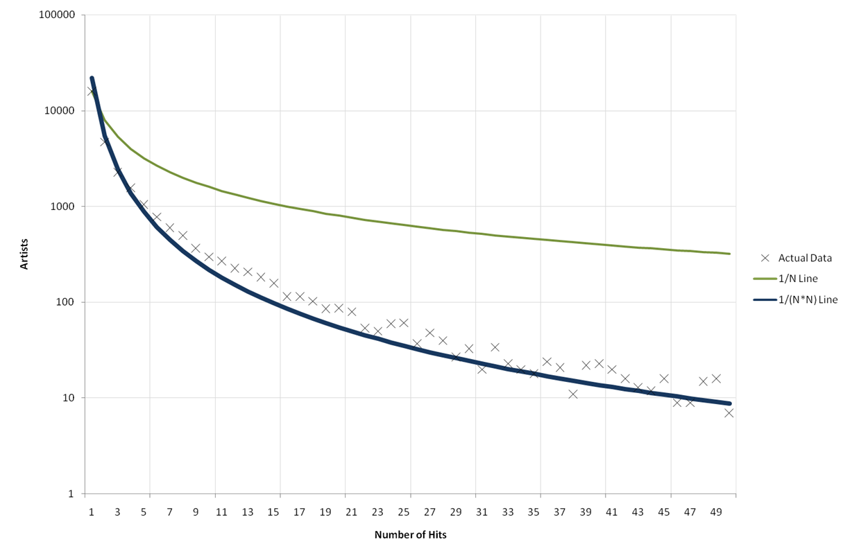
Using this scale a geometric progression would align the points in a straight line. Clearly the points fit some other smooth curve. We tried using an inverse function (1/N), that is the Zipf numbers. However while the shape is close the relative scaling is wrong. If we alternately assume that the number of artists with N hits will be proportional to 1/N squared the curve fits almost exactly.
To us this is a surprising result, we are not sure what underlying truth it is revealing. Clearly it demonstrates that the probability of an artist's next song being a hit is dependent on how many hits the artist already has (otherwise the line would be straight).
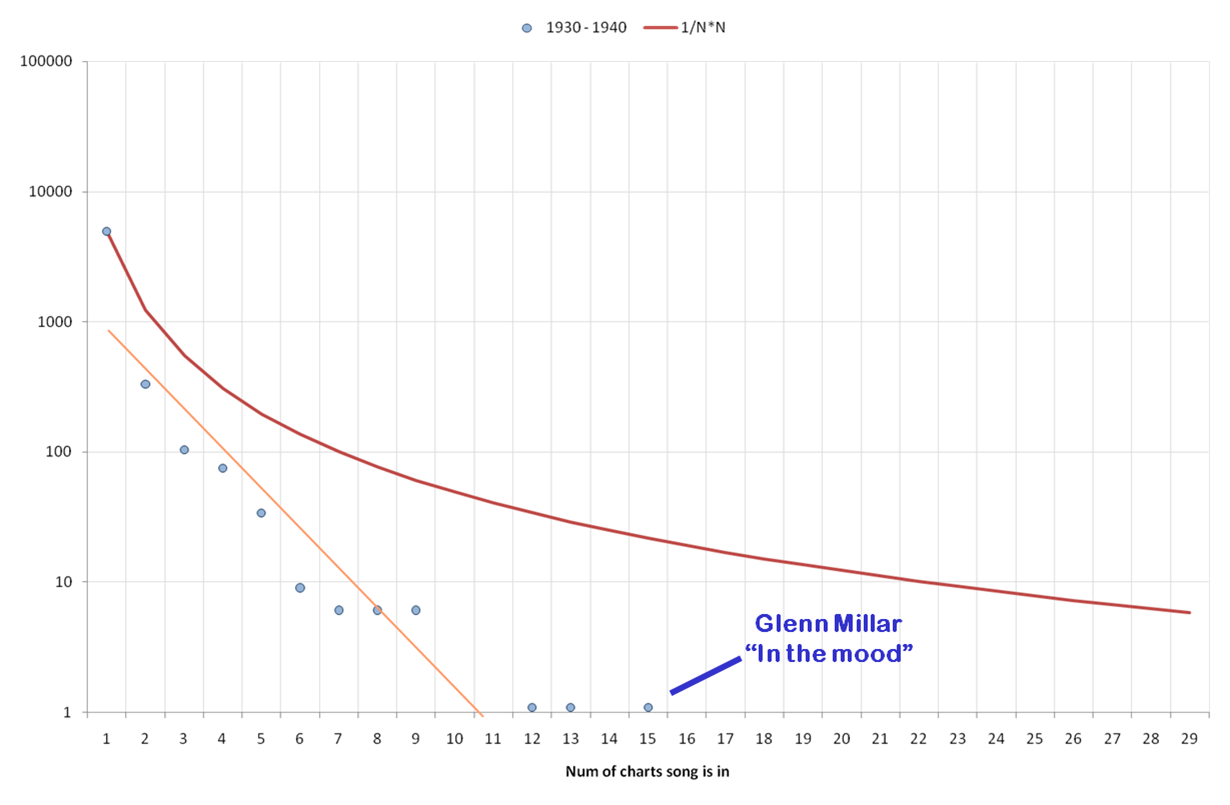
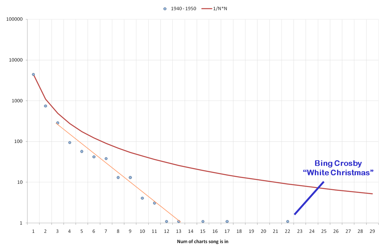
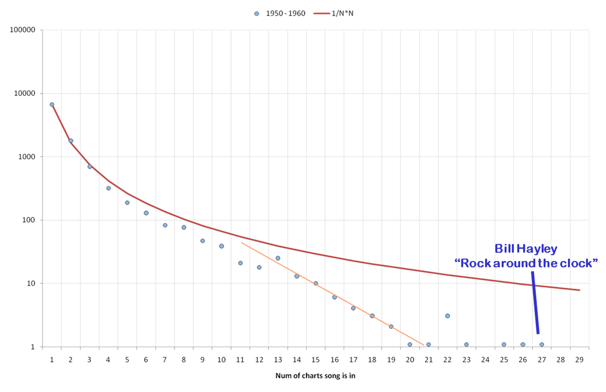
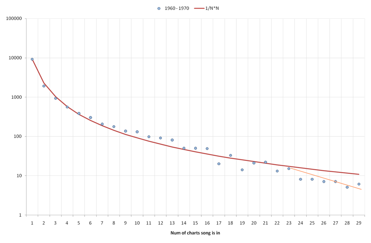
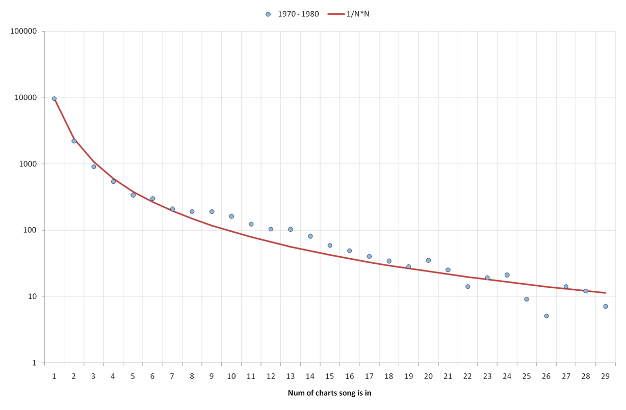
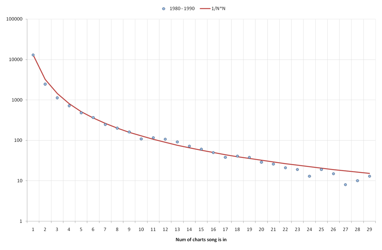
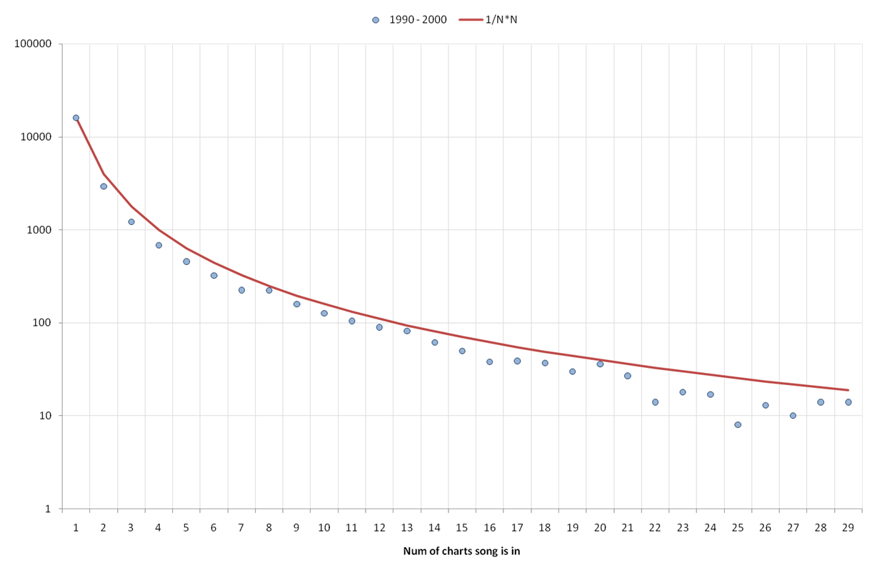
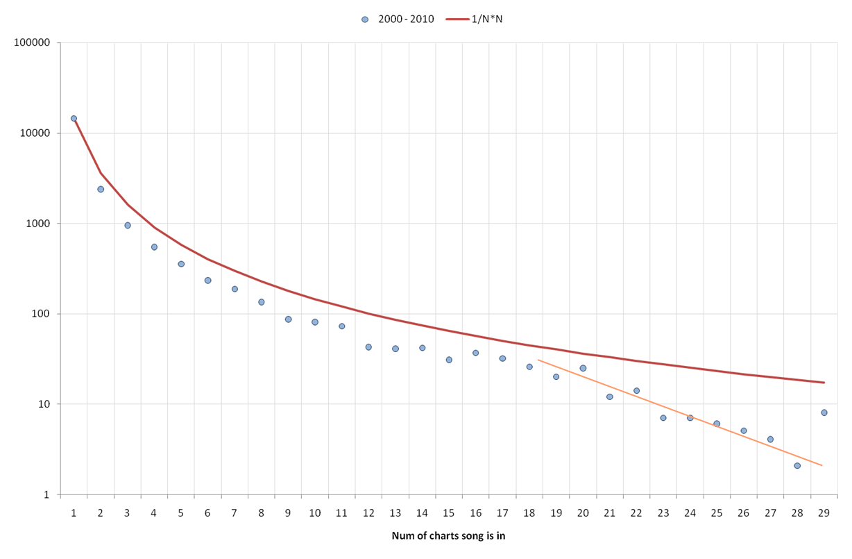
So what happens if we look at the number of charts that each song is listed in? The dramatically different number of charts for each decade mean that we need to split the data by decade. When we do we can see that for decades where the number of available charts is small, like the 1930s, the data points fall along a strait line. So where we have few charts they seem to be sampling seperate 'pools' of potential hits. The probability of a success in one chart is not a good predictor of success in the others.
However when the number of potential charts is significantly bigger than the number being checked for the points fall along the same '1/N squared' line. In other words, as one would expect, success in one chart increases the chances of success in the others.
This seems to be a general pattern for each of the decades (within the constraints of the data available). Could this just be a reflection of the number of chart entries we have? To answer that we can look at the number of chart entries in each chart by decade...
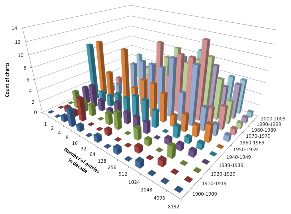
We can see that in the plot above. It shows the number of charts with 2, 4, 8 and so on entries. When we show the sizes using this logarithmic scale there is no obvious distinctive profile. That is to say that the sizes of the charts seem to be fairly evenly scattered. If the success of a song in a particular chart was entirely down to some kind of measurable intrinsic quality of the song, that is if each chart was measuring the same thing, we would expect the number of charts a song was in to reflect the number of charts that it was a candidate for. In other words the number of charts for each song should drop geometrically. The fact that is drops by 1/N squared instead seems to demonstrate that success in any one chart is significantly influenced by previous success in other charts.
We are sure that this distinctive curve is telling us how much influence each of the charts has, but our combined knowledge of statistics is not sufficient to work it out how much. If you have any insight we'd be happy to hear from you.
The Billboard Charts
The Billboard song charts that come from Bullfrog are the most comprehensive and cover the longest period of all the charts we use. One feature of these charts that we don't take account of when scoring a song is the number of weeks each track spent in the charts. If we group the songs by decade we can draw a set of curves that illustrates these values.
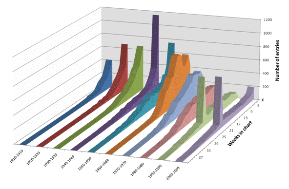
This plot illustrates a number of features, lets cover the three most obvious ones. First of all it is clear that before 1958 (when the "Hot 100" chart started) the most common length of time in the chart was just a single week. In this early phase the shorter chart length and the more informal ways that the information was gathered probably explains the "exponential decay" shape.
The next obvious feature is the clear spike at 20 weeks that appears in the 1990s. This comes from a decision that Billboard took in 1991 to exclude most songs after they had spent 20 weeks in the charts (these songs are moved to an alternate chart called "Hot Singles Recurrents".
The final clear pattern is the way that, since the 1960s the songs have progressively had longer and longer times in the chart and consequently the number of songs in any one year has declined.
Previous Comments (newest first)
27 Aug 2018
2010s awful?+
Is there any possibility that mainstream music will turn to be better in2020s? Are mainstream songs worst in 2000s, or 2010s?
"Better" and "Worst" are terms that are hard to measure. It seems to me (to express a personal opinion) that the quality of music varies with the amount invested in producing it. When music became cheaper to create the quality went down, when record companies focused on reissuing old music on new formats the quality of new music dropped. In my opinion music will only get better when the consumers stop buying the same plastic sounds and demand good songs. However that just shows my age (music was much better when I was a teenager :-) )
17 Jul 2018
Just curious
Some has claimed that pop songs died after 1986. (at least in North America) ^ Most of the exciting trends of the decade had either died out or became stale
^Hair metal was going through its power ballad phase with videos that took up a lot of airtime on MTV. This would prove to be the beginning of the subgenre's death (Unfortunately right) Do you agree with that?
I would suggest it is more true to say that pop music dies for most people before they are 30
26 Nov 2015
Just another hypothesis
Wow, I could spend days on your site!!!
Another option to consider in driving these trends, is the development of recordable media and "the playlist"! In the mid to late 70's cassette tapes became the popular media. +This was the first mass media that was portable and recordable... (OK, forget 8 Track!) I remember making my own compilation tapes from my cassette and vinyl collection to play in my car... now I was in control of what I listened to... then CD's, then the iPod, then streaming... playlists haven't made charts any less relevant, if they've kept up with music distribution methods, though piracy has diluted them, but playlists have fueled the "musical tribes" you refer to, and make it much more difficult for one song to enjoy success for an extended chart period. Just a thought.
27 Feb 2013
THE ULTIMATE RETROSPECT
I went thru just about everything in this site- every album of every year,every artist, single etc. and Id say the #1 conclusion Ive come to is that music started out bland but tasteful in the early part of the 20th century until rockNroll came along in the mid 50s; it kept getting better and peaked in the mid 60s, particularly 1966. After that it declined and has gotten worse and worse every decade. There were many great artists in the 40s, 50s, early/mid 60s, and the few in the 70s werent didn't have a place in the mainstream or commercial viability. +Im particularly pertaining to artists in these lists that were significant for whichever year, decade etc. And based off everything I've seen and been told its seems to me that the Beatles were the most over-rated, hyped up media affair. Im not undermining the good music they made but it boggles my mind how they were at the top of everything when they were in no way as great as they were perceived historically. The success of the beatles is a combination of the brilliant production of george martin, the consistent quality marketing of the media and the conformity of the masses. ALL these lists really go to show that the majority of the music that changed the world from the late 60s to the current is TERRIBLE. The music industry declined so much in the late 60s, continued to do so in the 70s and hasnt imroved one iota since. And this is coming from a young person under 30 who has spent their entire life absorbing every possible aspect of music history from the artists, to the songs, to the sales, to the significance and legacies. I apologize for being so blunt (or negative to the ignorant); please feel free to email me if need be.