 |
| Music |
| Songs |
| Song Years |
| Song Artists |
| Song Titles |
| Song Charts |
| Albums |
| Album Years |
| Album Artists |
| Album Charts |
| Site Index |
Why do you include charts that are not notable? |
|
One question we often recieve asks why we have incorporated a number of charts that are not "notable". That is charts which were generated by individuals or groups that are not as objective as, for example, the RIAA. Of course the first thing to note is that the official music industry groups probably have the most incentive of anyone to adjust the figures, and, at least up to the 1970s, there is evidence that the "official" charts were quite heavily manipulated.
Another point is that, as the reader, it is up to you to decide which chart entries you want to take note of. Each entry on the site has a complete list of its song chart entries or album chart entries. You can decide which ones are important to you and which to ignore. When checking on individual achievements, for example the peak position that a particular song reached in a given chart, all the data you need is presented.
However many people are more interested in an overall "score" rather than an individual chart entry. For example asking which female solo artist had the most success worldwide during the 1990s.
The fact of the matter is that a completely accurate and objective measure of overall worldwide musical success is not available from anyone for most of the period this site covers. Even as recently as the 1980s sales figures are particularly prone to exageration. Anyone who claims to know, for example, the real number of copies of "Thriller" that were sold is either delusional, or more likely lying to you (and that comment is intended to include our estimates of sales).
James Surowiecki pointed out in his book "The Wisdom of Crowds", that it is possible to combine a collection of rough estimates in order to come up with a collective view that is more accurate than any of the individual biased contributors. We have searched for lists that indicate relative success, and consolidated them to provide a higher quality, more objective overall result. For this to work we have to ensure that the various obvious types of systematic bias are reduced as much as possible:
- Period Bias: We try and incorporate charts that cover all periods rather than just the last few decades
- Country Bias: Don't have too many charts from any one country or region
- Artist Bias: We try to ignore any charts which focus on particular artists or genres
Of course in a perfect world we would only utilise well audited charts from the appropriate authorities for each region and period, but these are just not available. So we do the best we can incorporating as wide a range of inputs as possible and combine them using a transparent and validated approach. We also test the results to attempt to detect any systematic bias. Finally we listing all the inputs for each entry so the reader can select to ignore any of our inputs.
We believe that the final result represents the best current estimate of historical success of the songs, albums and artists listed. They are not perfect, but they are much better than most and, more importantly, easily accessible.
As with all the complex calculations described on the site you can decide to try a different approach. If you can think of a way to improve our results we would be interested to hear about it.
The Wisdom of Crowds
We claim that having a large collection of questionable data provides a better estimate of reality than relying on a small sampling of "notable" charts. This view was explained by James Surowiecki in his book "The Wisdom of Crowds". A lot of questionable claims have been made for this process, this section is intended to explain how we are exploiting this effect, and to explore its limitations.
The first person to express the idea was Galton, he noticed that the entries for a village "guess the weight of the bullock" competition varied wildly, but the average of all the guesses was more accurate than any individual. The process works particularly well for situations where all participants are estimating a numerical value (or a ranking, or anything else that can be expressed along a scale). It does not apply where discrete values are being sought, for example when writing an encyclopaedia entry the consensus is not always more accurate than the best contributor.
So in our case we are looking at a collection of music charts that rank different entries. Clearly this is a scale, rather than discrete values, even certifications like Gold and Platinum can be converted into numeric values (the number of claimed sales). How accurate should we expect a collection of say 10 or 20 non-notable charts as against 2 or 3 notable ones? The only way to test this is to set up a random trial.
Assume we have two songs, A and B, and that A is better than B by some amount. Each chart can be thought of as a process that takes the real quality score, adds on a random component and then ranks the songs according to this total. Let's start by normalising the random component of the score, for testing we'll have these values randomly distributed with an average of 0.0 and a standard distribution of 1.0, using the Normal distribution. Suppose we have N charts, each will assign an ordering to the two songs, how often will the "wrong" song win in the majority of charts? In other words what is the probability that more charts, by chance, claim that song B has a higher ranking. This obviously depends on how much better song A is and how many charts we use.
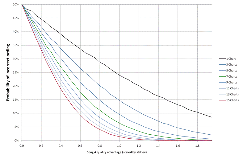
The plot above shows the probability of this type of error when the scenario is run a few 100,000 times. Obviously if the two songs have a tiny quality difference in comparison to the chart variation the probability of a incorrect estimate is 50%. For the best quality charts lets assume that the standard deviation of the chart differences is the same size as the song quality differences, that gives a score difference of 1.0 and a probability of a single chart getting the ordering of a pair of songs "wrong" as 24%. A low quality chart will have larger errors, lets say the error is twice the size, that makes the score difference 0.5 and having 7 such charts gives an error probability of 22%. This ratio seems to hold for all the values of the quality difference, whether a chart introduces random variation of 2 times or 0.5 times the quality score a set of 7 charts with twice the level of randomness will beat its performance.
In other words having 7 charts with double the error rates is better than having a single high quality chart. Is the random variability of "notable" charts half that of the "non-notable" ones? Our experience is that most "non-notable" charts are not much more variable than the official ones, and of course where a chart is clearly biased (like the VHS ones) we ignore them anyway. Of course we want to use charts of the highest quality we can get, but for most regions and periods they just aren't available. Dismissing charts because they don't come from an "industry approved organisation" is unjustifiable, a collection of poorer quality charts, properly handled, can deliver more accurate results than a single high quality one.