 |
| Music |
| Songs |
| Song Years |
| Song Artists |
| Song Titles |
| Song Charts |
| Albums |
| Album Years |
| Album Artists |
| Album Charts |
| Site Index |
Why are there so many/ so few USA based charts? |
|
Some visitors have sent messages suggesting that too many of the song and album charts are USA based while others have complained that there are too few.
The main element that originally decided which charts were incorporated was availability, obviously charts can only be incorporated if we have them. These days we only invest the time required to integrate a chart if it appears to be reasonably objective and covers a period or location that is currently under-represented.
There are lots of available charts from web sites that originate in the US and hence (reasonably enough) focus on US music. How can we decide if there we have included an unreasonable number of USA based charts? Probably the fairest way to answer such a question is by looking at the size of the music market in different countries. The US market is by far the largest music market in the world, however it is only just over one third of the global total.
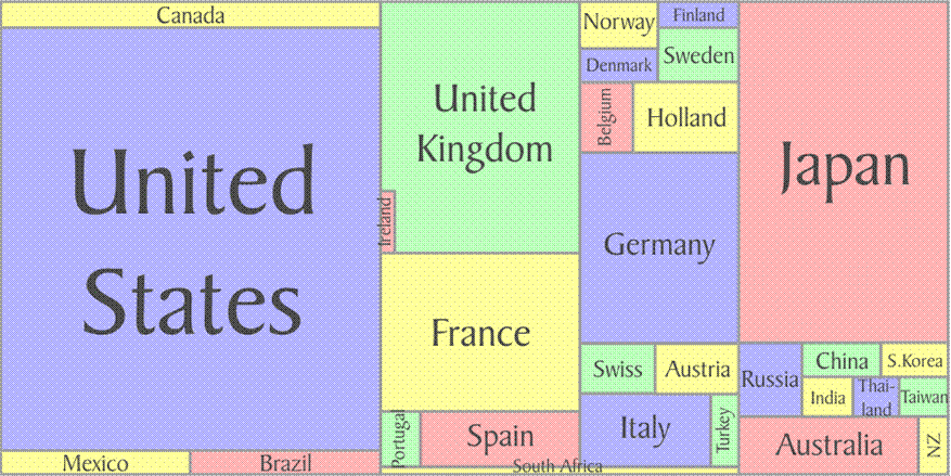
According to the IFPI (from //www.ifpi.org/content/section_statistic s/index.html) more than 95% of worldwide music revenue comes from the top 30 countries. These are divided up as shown in the diagram above. We have created a set of region comparison pages that contrast the top 20 songs for North America (39.9%) and Europe (37.1%) with the total world lists for selected years.
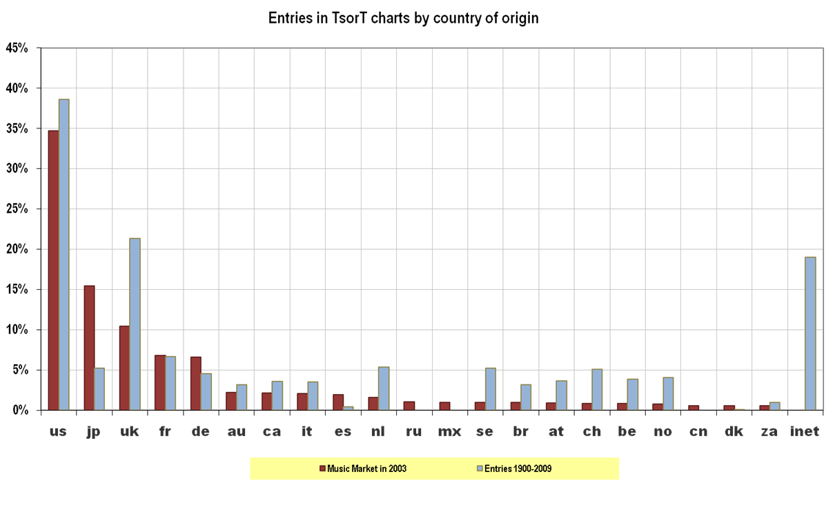
Comparing the revenue from the top few markets with the total number of entries in the TsorT charts we can see that the US is actually under-represented. In fact this picture is a bit pessimistic since it ignores the contribution from "internet" data sources, which tend to be mainly US based.
So, there is no evidence to support the contention that there are too many purely US based charts included in the list. If the contribution of the "internet" charts is ignored it could be argued that there are too few.
The one thing that this picture does show is that the lack of data from some countries, such as Japan. In this case the cause is the Japanese language, much of the most popular music in Japan has never achieved success outside the country, and the character sets make extracting data from some of the Japanese sources too complex for our developers. However if anyone can provide Japanese charts from before 1990 they would be gratefully recieved.
The chart also shows that many of the European countries are over represented, again reflecting the availability of data from these sources. A number of attempts have been made to compensate for this.
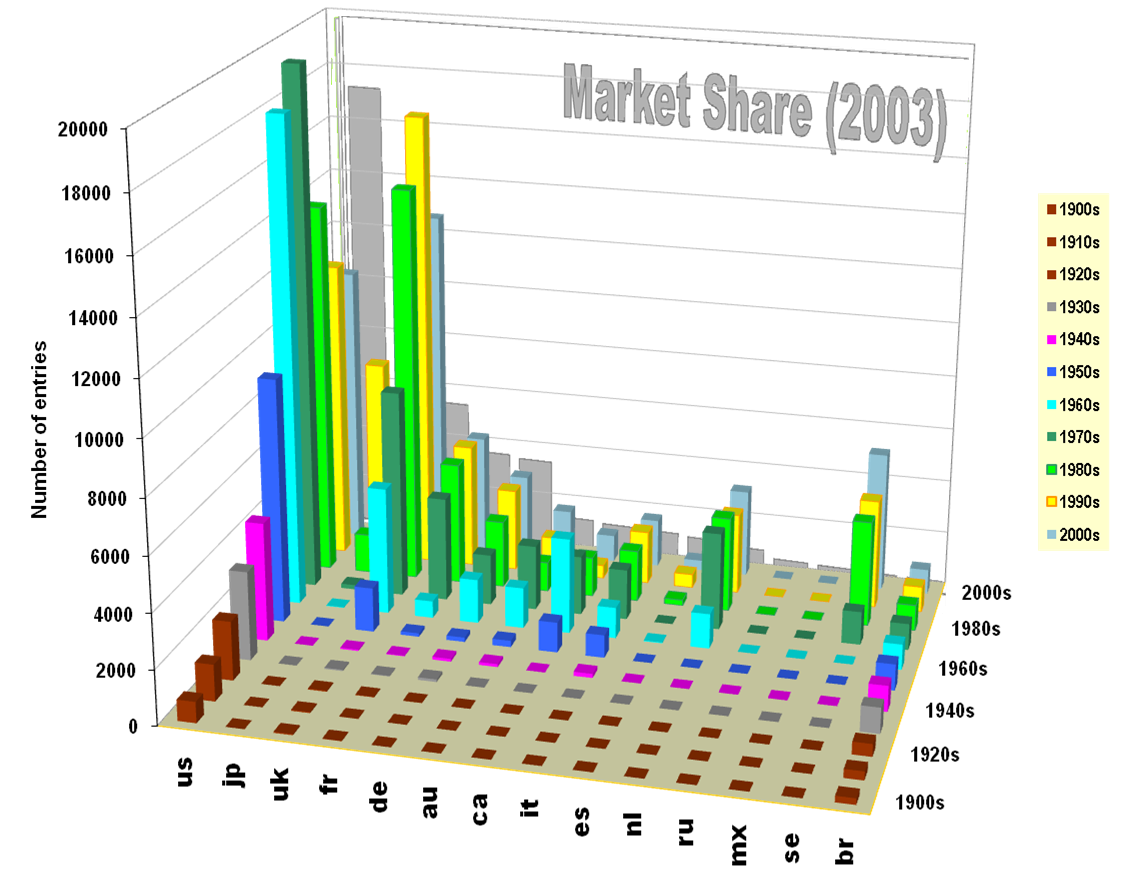
In fact when we look at the data over time the plot (above) give a clear indication of the limitations of the data that is available. We are always on the look out for charts from before 1950, or from Japan, Spain or Russia.
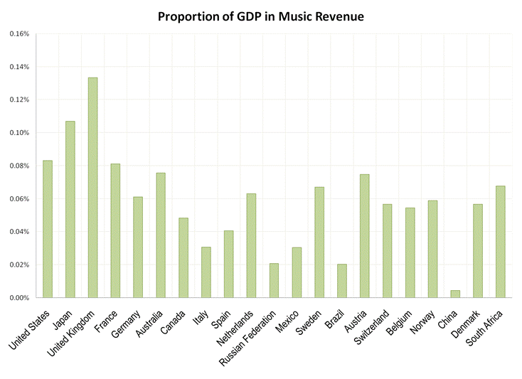
In fact now that we have included data from the complete official UK chart the one country that is out of most out of line with it's revenue figure is the UK. There is an explanation for that, the plot above shows the proportion of each county's GDP that the music revenue represents. Clearly by this measure music is more important in the UK than in any of the other major music markets. This explains why so much information about the history of UK music is available on the internet, the population is just prepared to invest more in the topic. So, it is true that the UK clearly has more entries in the data than can be justified by it's revenue figures, however the difficulty of finding a workable way to adjust the numbers and the fact that the average music spend in the UK is so high mean that we will just live with that.
As with all the complex calculations described on the site you can decide to try a different approach. If your analysis shows something interesting tell us about it.